
Every Screen. Every Device. One Perfect Experience — Responsive Design Done Right
Over 70% of your visitors are on mobile. We design websites that adapt fluidly to every screen size — from 4-inch phones to 32-inch monitors. No pinching, no scrolling sideways, no broken layouts. Just seamless experiences that convert regardless of device.
Since 2008, Creators Touch Global has been building responsive websites long before it became a standard. Every site we deliver is tested across 20+ device configurations and optimised for Core Web Vitals. Our responsive designs don't just resize — they reorganise content for the best possible experience on each device.
Fluid layouts that adapt to any screen size
Touch-friendly navigation and interactions for mobile
Optimised images that load fast on slower connections
Cross-browser testing on Chrome, Safari, Firefox, and Edge
Core Web Vitals optimised for Google ranking signals
Retina-ready graphics and crisp typography on all displays

Redefine your contours. Reveal your confidence.

Medically led aesthetics delivered with clinical precision and a subtle, personalised approach.
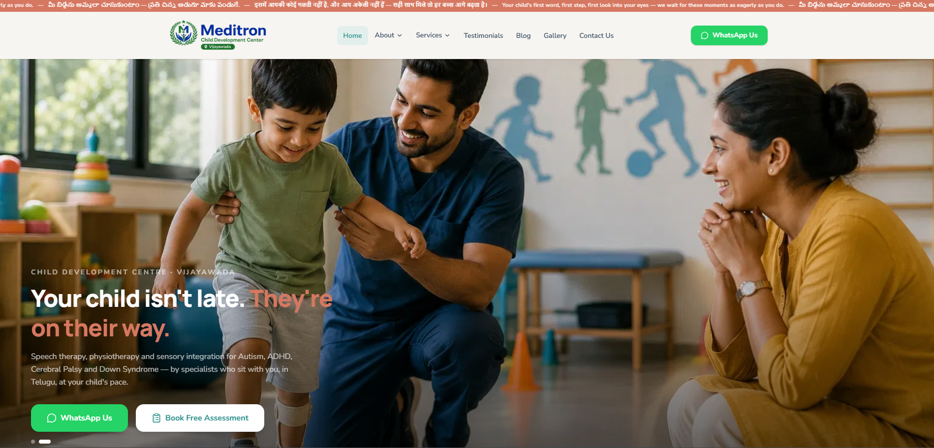
Helping parents find the right care for their child — starting with the first search.
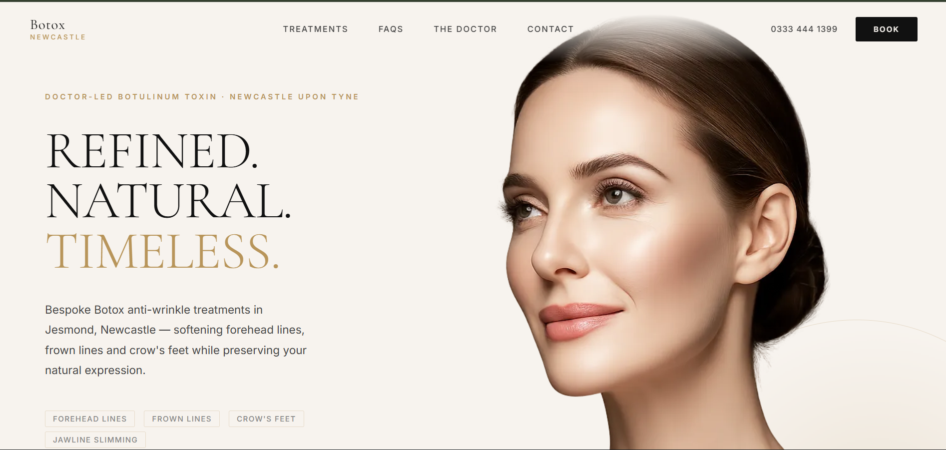
Refined. Natural. Timeless.
We learn about your business, your market, and your goals.
We create a tailored plan with clear timelines and deliverables.
Our in-house team builds, tests, and refines every detail.
We launch, measure results, and optimise for continuous improvement.
Tell us what you need. We'll put together a responsive web design plan built around your business and your budget.